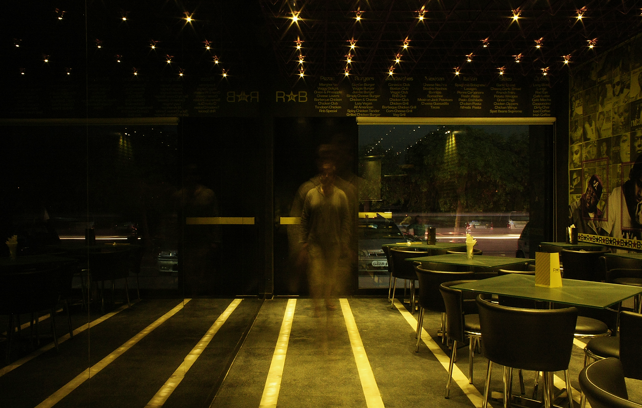
An intervention to revitalize a de-funct space into a restaurant.
The client's brief was simple. To start a restaurant chain with the flagship in Ahmedabad that serves intercontinental cuisine to the young generation of the city. A brand identity had to be created so that the features could be adapted at different sites in the country.
The aim of the project:
To create a brand identity and spatial intervention to introduce a unique dining experience.

The space being narrow, linear, and full of offsets, the walls and corners were flushed into a straight plane to make it easy to perceive the linearity of the space. A one-way mirror is used on one of the edged of the walls to give the perception of spaciousness. The edge next to the mirror was cleared for circulation and ease of access to the bar and the seating from the entrance. With the space frame holding the lights and the electrical services, the lighting is carefully curated to provide a fine dining ambiance.

Groundfloor plan


The design guidelines were derived from the RnB music genre. The branding primarily follows two colors: Yellow and Black. The wall graphics, the menu, letter pads and the like follow the same pattern. The bling wall in the space was designed as a backdrop for patrons to photograph themselves in front of. The same pattern is followed on the menu and flyers design to maintain a consistent style throughout all the design elements.

Conclusion: The project was the first attempt to execute design decisions beyond paper and computers. The space rendered was stylish and first of a kind in the city. The primary use of only 2 colors in the space was a decision that paid off well in creating the desired ambiance. However, if realized today, the project could have further refined. The branding and the styling of the space were replicated in other spaces. Also, the fact that space was designed and executed along with an ongoing academic semester during the bachelor program was an accomplishment. But, as a designer grows with time, I feel, the project could have been further refined.
If you have any further questions, do not hesitate to get in touch.
Project info:
18 weeks
Summer 2011
Spatial design + Branding
Independent commercial project
Team info:
Parth Pandya
Ankur Saraff
