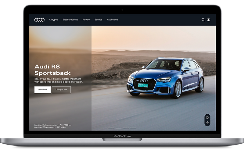
A brand-new experience for Audi start page.
(Speculative design exercise)

The goal of the exercise was to create a bold and premium experience for Audi with the existing brand guidelines; support the first time user in their research for the perfect car and provide meaningful entry points to the car configurator and the dealer search.
Project Info:
Speculative exercise - 3 Days
UX and UI Design
Audi AG is a German automobile manufacturer that designs, engineers and distributes luxury vehicles.
Providing a large variety of selection, www.audi.com/de is the first entry point to the German website that allows users to browse through the models and services offered by the organization. The intent of this exercise was to reboot the page with the brand guidelines in mind to provide a premium experience for first time visitors.
Analysis and pain-point identification (Current page)

The image above is how the landing page looks currently. The text over the stage image is not readable and the CTA is lost among the chaos. Different images are used for the stage creating legibility issues which is often the case. Apart from the legibility concerns, absence of an anchor point for the eye to browse and digest the content does not contribute to a great experience.
Molecules

In the current car configurator, the cards and the models are tightly placed next to each other with the CTA button attracting the most visual attention. Audi being a premium brand, the UI design of the configurator does not reflect the same values and message. Don't get me wrong, it is already a powerful tool. However, in my opinion, the product loses some of its focus within the UI.
The car configurator is also not accessible directly from the home page and hence adding another
pain-point for the users who want to review available modes and configure their car.
The proposal

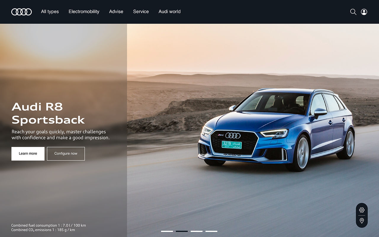
Introduction of transparent and blurred elements that allow text overlays.
It makes the text legible and distinct from the product images. The images of the car are always the focus while the text and the CTAs compliment the primary content images.
Sticky/Floating car configurator buttons added at the bottom right of the viewport.
It makes the text legible and distinct from the product images. The images of the car are always the focus while the text and the CTAs compliment the primary content images.
Introduction of a new color in the design system that reflects the premium nature.

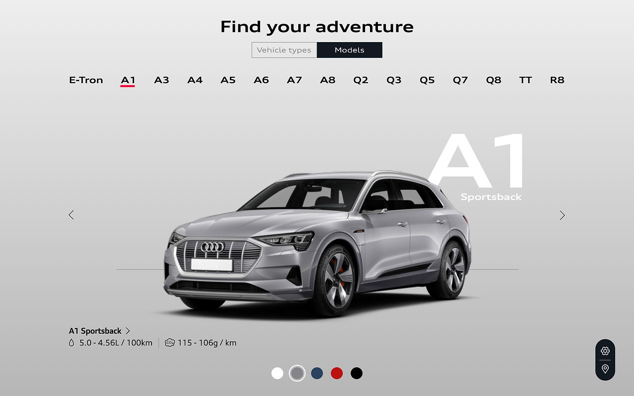
The car configurator is redesigned with the primary focus on the model and the users' ability to configure, browse and navigate different models.
The tabs at the top enable the users to switch and browse between different models while the carousel allows the user to view the cars from the different angles. The color selector at the bottom allows the user to see the model in available colors.
The UI has been lightened up by allocating the configurable components on the edges and freeing up space while maintaining the focus on the car.
The premium nature of the product is communicated by allowing the UI to breath and eliminating the cognitive clutter.

By introducing new and modern elements that facilitate legibility of text whilst allowing focus on the product, a color, that compliments the brand experience and easy access to the car configurator to browse models and dealers' locations can allow the user to have a premium experience on the website while maintaining a strong focus on the content.
It was very fruitful to work on a project like this as it allowed me to understand the system in place behind bold brands and the powerful tools that enable the users to achieve their goals.
However, with the time constrains and the limited brand guidelines and product assets available to the common people, it was a difficult exercise to understand the brand wholistically that would allow a thorough understanding of the pain-points, features and the thought process behind the decisions on the website.
I will be looking forward to the future where I accumulate a deeper understanding of the website which will then allow me to make better design decisions.
If you have any comments or feedback, do get in touch with me. I will be happy to discuss the project and learn your perspective.
